Monday, November 29, 2010

Scale

The other day I went to go see Wayne Thiebaud in Conversation with Kenneth Baker at the UC Davis Alumni Center.  However, I was just at the door when they said that the seats were full. 

Although I would like to talk about Wayne Thiebaud, this blog actually has to do with what happened while I was waiting in line.  While in line to see Wayne Thiebaud, I saw this very large scaled metal horse - which I instantly recognized as a work of Deborah Butterfield.  I wouldn't have known this unless I had written about her in a previous post, "Creativity from Without," and was extremely surprised not just to find out how ignorant I was about how large her work was (it was almost, if not, lifesize!), but also to find myself awestruck by the aspect of scale.  (But believe me, this was a pleasant surprise.) 


I don't think I realized how an aspect of scale can add another dimension to a work of art.  Just like I can't really explain how seeing a masterpiece in real-life definitely overrides a print any day.  I think it reminded me of how critical it is to look for design and works of art all around you - and to appreciate them while you can as well.  It's a privilege to have a piece or work at hand.

With that, not only will I be making opportune trips to galleries, but I'll be encouraging you to do the same.  There's nothing like "living color".

P.S. Maybe I'll try to post a picture up later when I venture out to the Alumni Center again.

Form and Content, Word and Image

Talk about word and image juxtaposed, the other day, my co-worker showed my boss posters based on classic novels.  On these posters, designed by Postertext, were images inspired by these classic works, only, instead of the picture being made up of lines and colors, they were made up of the first few chapters of the text.

Although text really actually is "lines" that just form letters, I thought it extremely interesting how form and content seemed to be switched.  Where the picture was the content, but the form it came in was in "words".

Here, I'll let you have a look:

The Adventures of Tom Sawyer

The Adventures of Tom Sawyer uses the ENTIRE text from the book!  Isn't that amazing?  Go get your reading glasses!
Moby Dick

20,000 Leagues Under the Sea

They even have a couple posters designed from other inspirations - you can go look and find out for yourself.


Saturday, November 27, 2010

The Interaction of Line and Color


When it comes to looking at color – and focusing on color, I like it when artists utilize color in order to place some kind of emphasis.  As much as line portrays life, color adds a soul.  Though I wish I could claim that thought my own, it was in 1574 that Marco Boschini stated, “Without color, il disegno may be called a body without a soul.”
Lois Greenfield is a photographer that not only captures the human body in motion, but captures an energy and essence of the person that I can’t quite put my finger on.  In looking through her portfolio, I noticed how in one work she was able to utilize colors specifically to add a quality to her photographs.
In this one in particular, she uses red in both photographs, but the red takes on new characteristics between the two photographs.  In the first, the red against the white and the light silhouette is takes on a weightless and airy personality.  The dancer’s position also emphasizes that trait.  On the contrary, the red paired with the black gives the red a darker and more fiery character. The dramatic movements of the dancer and the continuing line of the red fabric mark out this contrast to the first photograph. 
This work reminded me much of the slides of Josef Albers’ Interaction of Color and his theory on “reversed grounds” where a single color can seem like two when interacting with a different background.  If you look closely, these two reds are extremely similar, but the use of interacting this red with white and with black reveals the different personalities of this same red.  The first is a lighthearted red playing with white and the second is a dramatic red dancing with black.  You could say that these portray this red’s different emotions.
 I think it so interesting how a color is a color, yet when it interacts with other color it takes on so many different “emotions”.  Lines portray life, but color adds the soul to a work – completing the idea that so much of what is human can be communicated through something that is not human, like line and color.

Consequences (A Response)


In response to my last blog, I wanted to take a look at biodegradable containers and utensils.  I remember I first saw these when I was a freshman at Davis.  At the convenience store next to the dorms, Trudy’s, they had disposable forks and spoons made from corn rather than from plastic.  It was the first time I had seen something like that and lately, I’ve been seeing containers that are compostable as well.  On a bigger scale, FritoLay SunChips also have changed their chip bag packaging to 100% compostable ones.
Plastics made from corn rather from oil are called Polylactides.  PLA, as it is referred to, is both biodegradable and compostable, taking only 30-45 days to compost.  Plastic products made from oil, on the other hand, can take up to 1000 years to decompose.  Though plastic utensils and containers are what are most commonly used, they might not be for long.  “Cornplastics” (as I’ll call them) are being used now to make not only utensils, plates, containers, but “plastic bags” as well.  And more good news – they cost about just as much to purchase as products made from plastic. 
At the Davis CoHo, compostable utensils, bowls, and plates are used.  And from a previous post coffee lids are recyclable too.  I’m personally curious as to when the switch to biodegradable cups will occur. I know they are out there.  In researching about biodegradable foodware, I was happy to find that even straws have been made biodegradable!
Now, as with any thing, it is important to consider the costs of this recent trend.  In just quick research, I found that there is also a con-side to this seemingly revolutionary invention.  There is some concern that the “biodegradable” factor of these products isn’t as glamorous as portrayed.  Some specialists say that the cost to produce “self-destructing” bags is much higher than the so-called “benefit.”  The name “eco-friendly” is just an “insurance policy” for people who don’t take responsibility for disposing of waste and in reality, these bags may actually be emitting toxins into the earth they compost in.
It’s still too early to tell, but these questions are being raised – and rightly so!  Any design should be tested and critically analyzed, especially when it has the potential to influence the globe. 
I find it exciting that people are being motivated to design products that take into consideration the environment.  I hope that people continue to work toward environmentally friendly solutions and welcome any kind of criticism in order to improve their designs and take into consideration all possible consequences.

Unintended Consequences


I remember in high school my economics teacher told us to always consider the “unintended consequences” when analyzing the costs and benefits of an economic policy.  Yet my teacher translated this concept to everyday actions and choices.  Everything we do has a cost, and along with those costs it is important to remember that sometimes our choices have consequences, which, sometimes aren’t initially seen.   
As a designer it is very important to consider the consequences of a design, especially if it has the potential to influence people’s lives.  In the case of Sten Gustaf Thulin, an engineer in the 1960s, it was most likely his intention to help the enviroment from the production paper and paper waste.  However, when he invented the die-cut plastic bag, commonly known as the white plastic bags we take home from the grocery store, little did he know that his invention would be one of lead characters in the debate in environmental protection.
Plastic bags not only play a major role in landfill and recycling debates, but they also have contributed to other environmental issues aside from residing in the landfill or emitting toxins during its production.   Besides from taking over 1000 years to decompose, plastic bags that are not properly disposed of or recycled often are left to wander areas of the earth.  It is not uncommon for animals to die due to accidental indigestion.  Littered plastic bags also affect sea life; thousands of marine animals, including turtles and whales, die from choking on these plastic bags.
Engineer Sten Gustaf Thulin probably did not intend for his invention to affect so many lives (both human and animal) in a harmful way.  In fact, people have given him the benefit of the doubt that he probably meant to help the environment.  But in saying so, I think it is especially important for people – especially designers – to be responsible in considering critically the potential consequences (good or bad) when creating something.

Monday, November 15, 2010

Image is Power


Greek-Byzantine Ikon of Theotokos
People always say that knowledge is power.  Well, maybe its more the idea of being able to communicate some kind of information that is power.  A month or so ago my Design Professor brought up the topic of iconography – and that “Image as Power.”  His specific example was the Ikon of Theotokos, where in some religious practices an icon possesses a kind of mediator power between earth and heaven.  For me, I started thinking immediately of propaganda icons.  These particular icons all convey different messages, and if design is a conversation – then being able to communicate through an image does in fact hold some amount of “power”. 
My first few examples include the iconic “Rosie the Riveter.”  This today is a symbol of strength for women.  In its context it was a icon representing and encouraging American women to be part of the war effort while men were abroad fighting the Second World War.  The Rosie icon did far more than just encourage women at home, but the War Advertising Council managed to recruit over two million women into the workforce through the propaganda of “Rosie the Riveter.”
"Big Brother" movie poster
Another major icon I thought of was the character of “Big Brother” from George Orwell’s novel, 1984.  Not only is it now a world wide known concept and “character”, but it the idea of Big Brother is used widely in political and social debates as well as an iconic term for everyday conversation.  Instead of having to explain the idea of an all-seeing, all-controlling government, Orwell managed to create an iconic character that now personifies all things related to the topic to which people can now refer.
I think another perfect example of being able to just simply communicate is the “OBEY the Giant” poster.  I still can’t really figure out what the exact message is – except for the fact of proving that something can catch people’s attention, be communicated, and passed then on - even when that something is not obvious or clear.    
What I find most interesting is not just how an image can convey and communicate so much (or…very little), but how people have even managed to use and reuse these iconic images to further communicate a message.  Here are some to demonstrate a few:


"Rosita" by Robert Valadez

I think then that it can be said that design has power.  However, I hope that designers will take into responsibility what they will do with that power and choose wisely how to handle it.

Be Ready for Anything


This week’s blog is largely in part inspired by an even that occurred last week.  This past Friday, my dog Cory got hit by a car.  This was something I definitely was not ready for and when I got the phone call that he was on his way to the vet, I was shocked completely.  He’s doing fine now and without going in too much detail, he came home on Saturday with a bitten tongue, a large gash that needs stitches, but no broken bones.  ‘Til tomorrow (he’ll be getting his stitches!) he’s bandaged up and getting alot of rest.

This weekend I spent my time looking after Cory and making him juk () instead of his usual puppy food.  However, I did happen to notice his compression bandages.  He was wearing two different types.  Today I watched the veterinaries place a self-adhesive wrap for compression and a very similar one with more sticky adhesive to hold the first in place.  Observing it made me realize that these types of bandages are very well designed and deserve recognition for what they – the designers – have contributed to the medical world. 

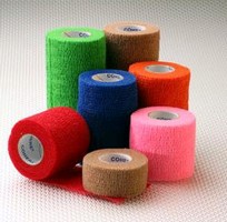
COTEAR bandages by Tape-O
For this blog it was challenged to critically analyze a product of design in respects to the “5 Areas of Ergonomic Research.”  In this case, I think it is even more fitting to use such a basis to look at the design of COTEAR medical bandages by Tape-O.

First and foremost, COTEAR bandages were made for medical purposes.  Not only for humans, but is used for animals as well.  I’m not sure if they are packaged “sterile,” but should they be used on a wound, a sterile gauze or pad is supposed to be used.  The material breathes well which allows a wound to breath.  The material also comes both latex and latex-free, which allows for options when dealing with people intolerant to latex.  As far as safety is concerned, even when faced with medical emergencies, these bandages are not only safe, but designed to address situations were safety is a high priority.

In regards to comfort, COTEAR bandages are not only flexible and elastic, but they were made to stretch in order to conform to the contours of the body (be either human or animal).  The material is not only flexible and cloth like, but its breathability also contributes to the fact that, even after being wrapped in these bandages, a person can still be pretty mobile, and movement of ones appendages is still accessible.

COTEAR bandages are also very easy to use.  They come in rolls and in various sizes.  The COTEAR bandages, though usually cut when used by veterinaries, doctors, or physical therapists, were designed so they could be torn by hand.  The different sizes are coded in various colors, making it easy to quickly choose an appropriate size without compromising time.

 Like already mentioned, COTEAR bandages’ design also takes similar form to a net, which allows any kind of wound, or even just skin, to breath.  The elastic weaved into the fabric not only allows the COTEAR material to flex, but provide support to whatever area that needs it.  In the case of Cory, it is his “elbow” that requires compression and stitches that is supported.  On the contrary, in the case of athletes (like my sister), it could be used to provide pressure and extra support to a knee or a wrist without hindering too much movement.

As far as aesthetics, which would be a low priority, the designers still managed to successfully create bandages that not only perform well, are easy to use, and comfortable, but they also designed bandages that come in a variety of fun colors.  Presuming that being bandaged up is not the most fun thing, the colors do provide an optimistic outlook.  Yesterday, Cory’s bandage was a bright yellow, today it's a dark green.   Looking at the other colors available, there’s also a red, blue, pink, and orange COTEAR bandages.  (There’s also the option of nude/beige).  I think the only thing I could complain about is the smell.  The other day Cory and I were napping and his leg smelled like ripe rotten macaroni and cheese.  However, I can’t tell if its him, the bandage, his wound, or a combination of the three.   Nevertheless, I can say that regardless the smell, I’m very grateful to the designers who worked hard to create this product.  Not only have they contributed to the medical world, but they have made their own mark in society.  The use of these bandages may be used strictly for medical or athletic reasons, but when Cory was hit by a car and needed attention, the veterinaries and technicians used a product that was designed with these needs in mind.

I think it’s true – that design can be found anywhere at any time.  I’ll just end with the words of Michael Bierut, “Not everything is design. But design is about everything. So do yourself a favor: be ready for anything.”

Cory at home resting

Monday, November 8, 2010

艾未未 - Artist, Designer, Political Activist


Beijing Olympic Bird's Nest Stadium by Ai Weiwei
            It is recent news that Chinese artist and designer, Ai Weiwei (艾未未), was put under house arrest in China due to conflict regarding the demolition of his studio in Shanghai.
Without getting into too much detail of what is going on, I was introduced to this man’s work and how he uses his art and his design to create conversation and to represent his voice in China.
Sunflower Seeds
            I think one of his works that Americans will recognize was his design for the Beijing Olympic Bird’s Nest stadium.  However, his work has been gaining attention for quite a while and is most notable for his strong political opinion.  One of his most recent projects was a room in Tate Modern Turbine Hall, which is filled with one hundred million porcelain replicas of sunflower seeds, each painted by Chinese artisans.  Some inferences include the topic of mass production or Mao as the “sun” of China.  In looking up other pieces of his work I find that his project indeed have some message to them.  For me, I might have to dig for what those might be, but I am curious to find them since his works are captivating.  Especially now, since he seems to be trying fervently to hold a conversation with a medium other than words.  For now, I’ll just post some pictures of what has caught my eye – and what I want to investigate.

 
Fake Studio
Forever Bicycles
Han Dynasty Urn with Coca-Cola Logo, 1994

Letters and Stories


There was a story I once read, I can’t remember where, (maybe Highlights magazine?) about a girl aspiring to be a writer.  She described her preference to writing by hand and letting the ink of the pen hit the surface of the paper, giving her story character and personality through just the writing – which proved to be another motivating creative force behind her story-writing.  She contrasted this picture with the process of typing a story on the computer, where words and letters were became cold pieces of concrete. 
I don’t remember why exactly this story stuck in my head, but I knew it always bugged me that I couldn’t remember where I read it because what I do remember is the feeling that the written word conveyed so much more than just the words itself. 
Written words (in contrast to typed or computerized) offered more depth than just the definition and comprehension of the words and phrases put together.   Now a lot of this is arguable since perhaps many of us would look at old typewritten letters or word-press books as mediums with “character.”  However, when you look at handwritten notes, letters, or signatures – there so much of a story that can be found.
A few weeks ago I was in an antique shop and just as I was about to leave, my eyes fell upon an old green Victorian guestbook, filled with notes and letters to a woman.  For ten bucks I was able to read through all these notes, imagine stories, assume relations, mysteries, maybe secret likings to this woman who asked all her friends to write a small note in order that “whate’er befall, The names of all my friends’ recall.”
Each of these notes had characteristic handwriting, beautiful lines of elegance that portrayed a little bit about the person who owned them (you can read my blog about how lines portray energy).  Some I would recognize and go back and realize that some friends had written more than one note of sincerity.  I mean, this was back in the day when people would study the art of writing in order to convey a certain image of themselves.
One particular handwriting that caught me was that of the woman’s daughter.  In one of the first pages a beautifully written note is addressed to her mother.  However, I came across another note from the same daughter but in much more crude handwriting.  it must have been written years earlier since it conveyed the characteristics of a little girl in her first years of learning to write.  What a story that has!  Just by the handwriting alone I started to imagine what their relationship was like, and how it might have been for the daughter, years later, to come back and write again in her mother’s book.
            I think that written words are kind of like an art – somewhat like painting.  A person’s handwriting can convey a little bit about themselves and maybe a little more about a story.

"The Rag Man"


I remember the first silent film I watched.  I had just come home from school and had turned on the T.V. to Turner Classic Movies when I saw early black and white film scenes set to music – no audible words.  I was pretty ready to dismiss this, thinking to myself, “I don’t want to spend any effort right now to try and figure out what’s going on.”  But as soon as these thoughts came into my head, the title card for the scene came up, I read it, and then I found myself hooked. 
MGM's The Rag Man title card
The film was The Rag Man.  Produced by Edward F. Cline in 1925 and starring Jackie Coogan (discovered by the unforgettable Charlie Chaplin, and later known as The Addams Family’s “Uncle Fester), it captures the story of a young orphan boy who survives a fire.  He gains his freedom by the mistaken belief of his perishing, and roams around with a “junk man.”  These unlikely two develop a special relationship that the rest of the film reflects. 
Max and Tim
While watching this movie, I found myself completely mesmerized by the story.  Although the words were not audible, they were just as important in the role of captivating the audience.  In fact, the creators of the silent film probably had to learn the knack of capturing an audiences’ attention in a different way than actors on a stage do, or “talkie” movies that include modern films today.  Cartoon artist, Brian Fies, explained that when words and picture come together, they should be dependant so that one cannot stand alone without the other.  His analogy was something that words and picture should be what rock music and lyrics are when combined.  Lyrics alone are just “bad poetry” and rock music is really just “a bunch of chords repeated and strung together.”  Yet, when put together, they create a medium that is enough to make one cry.  In the same way, when words and picture are put together in a successful and artful way, they can create something that captivates a person, as The Rag Man did for me. 

Singin' in the Rain's "Royal Rascal"
P.S.  As a side note, I love Singin’ in the Rain’s satirical usage of this concept – which in fact, only proves how written word and picture can unite to create something that, once again, captivates people.

Monday, November 1, 2010

Butch Cassidy and the American - Sorry, Sundance


I must first off say, that this blog was sparked by Intentional Design’s blog, “Compare and Contrast: Design in Film Posters 3 - The Good German”.  I was stoked when I happened on his blog because it reminded me of those fuzzy feelings that were conjured up when I first saw the poster for The Good German.  When Intentional Design noted the reference to the unforgettable Casablanca classic I was enthralled since not only is Casablanca one of my favorite films, but to know that there are still nods to the era of the silver screen made my day.

After reading his blog, it reminded me of a similar experience about a month or two ago when I saw the poster for The American.  I haven’t seen the movie, but I love the poster. 

For me personally, it struck a chord with another classic film, this one from the 70’s (er, 1969).   Both The American and Butch Cassidy and the Sundance film posters use two or three basic and contrasting colors.  The American: a dense orange contrasts with the black and white used for the type and silhouette of George Clooney.  Butch Casssidy uses a yellow to contrast with the black silhouettes of Paul Newman and Robert Redford.  Notice that there are also references to pure black and white imaging as well.  The American - George Clooney's figure; Butch Cassidy - the inset of Butch and Etta riding on a bike.  The typed credits are also in similar placements; skewed and aligned to the bottom left half of the poster.  It’s also not unapparent that the main figures in these two posters also happen to possess some ammunition.  

Whether or not The American movie poster, designed by Mojo, is a tribute to the vintage style of classic films is not part of my knowledge.  However, when looking at this poster I, myself, cannot help but recognize that I am reminded of images from an earlier Hollywood.  It may serve as an example of how images (or styles) can become iconic, and then serve as another means of communicating a type of message (in this case, perhaps a reference?)

Objectified


Objectified by Gary Hustwit is a documentary style film that searches for the relationship between mass-produced objects and their designers.  It does not just skim the surface of the background of the designed objects, but the film also covers interviews with the actual designers themselves in order to really find a truer history of the life of these objects, but also understand the intent behind their design., in an interview with Wayne Taylor, had said “Like Henry Ford once said, ‘Every object tells a story, if you know how to read it.’  So I enjoy digging into these little stories behind the hundreds of objects we touch every day, that usually go unnoticed.” And as is appropriate, Hustwit goes into finding these stories in his film, Objectified.
Andrew Blauvelt
I think one of the most surprising examples of a story behind a common ordinary object was Andrew Blauvelt’s explanation of the Japanese toothpick.  He points out that the Japanese toothpick, unlike its American counterpoint, has a blunt end with grooves around the circumference of the flat end.  Those grooves serve more than aesthectic purposes:  The grooves allow for easy break-off of the flat end, sending a signal to others indicating that this toothpick has been used.  The broken off end can also be used as a small stand to prop the tooth-end of the toothpick from the table surface.  Blauvelt, after revealing the “secret” of the Japanese toothpick, goes on to explain that this unveils more than just the secret behind its design, but it also gives people a glimpse of the design history that went into creating this otherwise commonplace Japanese utensil and a look into the culture from which it came from.
Andrew Blauvelt reveals the "secret"
The film Objectified covers many themes and many topics, but if Bierut’s words are true – that not everything may be design, but “design is about everything” – then we must be, in fact “ready for anything.”  Whether that design is considered “good” or “bad” is another story, but as Gary Hustwit explores in his film, design and the story and intent behind that design can be found everywhere.

Briar Coffee Cup


In an effort to get away from a less than quiet household, I retreated today to Common Grounds to study and do some blogging only to find that tonight that the internet here was, unfortunately, down.  I actually almost gave up trying to get any work done when I realized that I could, in fact, take the opportunity observe objects of design around me that I probably would have initially disregarded.   
            So here I am, staring at my Latte, realizing that the lid enclosing my hot purchase is a product of design.  These plastic lids are mass-produced, well known companions to any avid coffee drinker, and so incredibly common that the idea that these attachments to the ubiquitous Solo cup required some kind of effort of design may well have been overlooked. 
Karat Hot Beverage Cups
            However, the more intently you look at this seemingly mundane item, you begin to realize the amount of effort that must have been put into designing this plastic lid.  Think about it, hot beverages are a considerably dangerous product.  Careless design could leave a cheerful coffee drinker a regretful one should the container allow a leak or a malfunction cause a spill (which, I am sure, is not unfamiliar to a few).  
Briar Pipe
            This lid, produced by Karat, is black.  It consists of a raised outer circumference that has a oblong hole to allow for convenient sipping.  Behind this cutout the lid dips down into a trough that slants at an angle so that should any liquid escape from the inside, it channels down to one collected area and not drizzle down elsewhere, like the sides of a cup where it will most likely get sticky.  There are also holes in two places, one at the bottom of this trough and one opposite the drinking opening.  This, no doubt, allows the consumer a more smooth drinking experience – that if volume is displaced, it must be replaced. 
Yet, the first thing I noticed was that the lid is just a part of a two-part functioning whole, much like the Briar Pipe that Le Corbusier characterized as the Zeitgeist symbol of his day.  Is this the Zeitgeist of our day?  Disposable cups and lids? The first thing that comes to mind is “landfill.”   However, in my research both Solo and Karat are making efforts to make their mass produced products “green” and eco-friendly – a task that many notable designers declare should be the responsibility of designers.   
So all in all, this two-part disposable coffee cup is in fact, a product of intentional design. Everything from its shape, to its color, and even its biodegradable makeup are just a few aspects of the effort put into designing this product.
Karat Earth Products