Monday, October 18, 2010

Go 2


Pink Floyd
The other day I was listening to some music, browsing artists, and researching bands up on the internet, particularly XTC.  What caught my interest was that one of their albums was noted for its album cover art, which was designed by British art design team Hipgnosis.  Now, I can’t say that I know a lot about their work, but they’ve obviously have built up quite the “resume” by doing art work (many of these now iconic) for bands such as Pink Floyd, AC/DC, Led Zeppelin, Yes, Genesis, and more than a handful of others.  

What intrigued me about their work for XTC’s “Go 2” album was that its design was novel, it was different.  It basically depicted the structure of the design itself.  Here, I’ll just let you see for yourself:

XTC "Go 2" cover album design by Hipgnosis


They do this not only for the back of the album but also for the cassette release as well.  

XTC "Go 2" back cover album design by Hipgnosis


If anything, its brilliant in exactly what it describes.  It caught my attention, lured me in – I fell victim…and maybe, just maybe, brownie points were added subconsciously in favor of the album. 

XTC "Go 2" cassette design by Hipgnosis
As a work of design, I think its great because although it might be stating the obvious, its obviously not the norm.  It’s so simply “unimaginative” that it proclaims “creative.”  I personally like the design because it takes thinking inside of the box outside and sometimes, I think that's something designer’s need to do.  Kostas Terzidis explained that the concept of novelty in design just merely an illusion of creating something new.  Hipgnosis’s radical design was merely going back to the basics of what an album cover is (or how they explain).  This doesn’t devalue their work for “Go 2” in anyway.  In fact, I think it only makes it more admirable because of the fact that they were successful in creating exactly what designers all try and aim to do – to go back to the roots and from those roots make something, even if just an illusion, new.


My only question:  With the age of technology developing and the music industry taking place more on the internet via download, what will become of the art of album cover design?  Your thoughts?

Compare and Contrast


The other night, I was talking to my roommate about book covers.  I had a copy of Gone With The Wind and we were discussing the difference between the very romantic and picturesque illustrated one I owned and the traditional hardbound cover we would normally visualize.

This conversation reminded me of an a day a few months ago when I was walking through the bookstore and my eye landed on some very colorfully illustrated novels.  Thinking they must have been the new young age bestseller, I was struck when my glance caught the titles of Pride and Prejudice, Jane Eyre, Wuthering Heights, and The Picture of Dorian Gray.  I was dumbfounded – startled.  These were novels of which I had grown accustomed to seeing accompanied with them a standard period piece of artwork for the cover.    


What was this saying?  To have classic pieces of literature paired with more modern artwork? These drawings were animated - and even a bit gothic (something I never would have imagined except for maybe Jane Eyre or Dracula).  But this led me to investigate the artist, Ruben Toledo


Ruben Toledo actually is a designer and an artist who has touched upon many areas including fashion, illustration, mannequin-making, and film.  He, and his wife Isabel Toledo, are creative duo who work on their separate passions (hers is fashion) but feed off the inspiration from one another and all around them.  After reading a little bit about their creative process it was interesting to see a little glimpse as to where these illustrations for these classic novels came from.  Ruben Toledo finds inspiration everywhere, especially “weird” things (which probably explains the surreal characteristics of the cover art). 

What actually is trying to be said?  I can’t say for sure.  But these are classic novels.  And what deems them “classic” is the idea that these stories are timeless, enjoyed by generation after generation.  However, just because they are timeless, doesn’t mean that how they are conveyed to reading audiences have to be stuck in a time capsule.  If anything, maybe these novels deserve this vamped up outfit, they sure deserve it if they’ve been able to stand the test of time.  And if it catches some new reader’s eye, that's just even better.  It’s just like adding a new outfit to a wardrobe.  For the times when the timeless black dress is desired, hardcover and standard bound versions will always be available, and for those times when its just fun to spice it up a bit, I think Ruben Toledo found the ticket.


Penguin Classics Deluxe Edition by Ruben Toledo

BOOK CLUB: THE CLASSICS 

Design As Conversation


During high school, I was incredibly involved with my school’s color guard.  After the fall season in which we would perform alongside the marching band, we had our own season in the winter called “winter guard” where the guard performed its own show to a recorded piece of music.  Being a dancer, this was my favorite season of the two because the winter season, I thought, relied more heavily on dance as a medium and was much more “up close and personal” since the show was performed inside a gymnasium rather than on a football field. 

Throughout my color guard career, a lot of the guards, both high school and independent guards, seemed to follow a trend of putting on shows filled with intensity, drama, and mystery.  However, on the first competition of my senior year, a show by Santa Clara Vanguard caught me (and many others) off guard (excuse the pun).  Their show, “On A Breath,” was subtle, gentle, and unique.  It grabbed the attention of the entire audience.  We all watched the calm sweeping movements of the white flags and the spinning of the rifles and sabers.  There were no sharp movements, harsh dramatic lines, or overwhelming intensity.  Instead, a curious sense of intimacy was conveyed as time and time again, pairs of performers united before splitting off again. 


Its hard to pinpoint exactly what the exact message of the show was.  However, that doesn’t seem necessarily important since, for all I knew, I found myself with tears in my eyes.  I had never felt so emotionally connected watching a guard performance before.  I wasn’t the only one either, who had shed a tear or two; the entire audience was moved.  I think the most common phrase said to one another after their performance was, “Wow…I don’t know why, but I started crying.” 

As mentioned in my first blog, I think it is a deep-rooted desire in humanity to want to communicate, to converse, to have relationships with other people.  With that desire, we have devised ways to communicate.  As designers, it is only natural to try and find unique ways of having conversations with anyone who will listen, see, or touch; pulling together a language composed of various mediums whether it be the written language, art, music, film, or movement.  The designers of SCV’s show, whether you call them the directors, the choreographers, or the performers, all utilized their capabilities to try and communicate – to have a conversation.  This conversation, made up of colors, music, and dance, moved so many people and not only reflected a conversation between the act of design and its audience, but also between people: between the performers themselves, between the show and the audience, between the audience members, and even between you and I as you read this. 
I think that design is a just another way to have a conversation.  However, as designers it is our responsibility to not only realize that there are many doors available in finding ways to communicate, but that those doors should be opened and utilized to create conversations.

"On A Breath" by Santa Clara Vanguard

Monday, October 11, 2010

Lines


Last week I went to see a visiting lecturer and artist, Lampo Leong, discuss his work in “wild (Chinese) calligraphy” and share a little about his research, The Visual Forces of the “Omega Curve.”  He particularly exercises his artistic expression in “wild calligraphy” but his current work in progress, a book entitled the aforementioned, explains his study of works of art that seem to possess a timeless “grandeur and loftiness” and his search to discover what exactly it is that draws our eyes to these masterpieces.

The Milkmaid by Vermeer
     Being half Chinese myself and currently learning the language, I was interested in seeing what exactly defined beautiful Chinese calligraphy.  However, what did analyzing pieces of artwork had to do with Chinese calligraphy?  His argument was that all these beautiful and captivating works of art, including calligraphy, had one thing in common: the excellent use of Omega curves.  These lines are considered unique because they are found all throughout nature: they possess not only a round oval curve, but also a sharp straight contrast.  Moreover, these lines had to a “qi”, an energy that flows through the line, hence giving the artwork form and vivacity - a life of its own.  


Lampo Leong's Wild Calligraphy demonstration

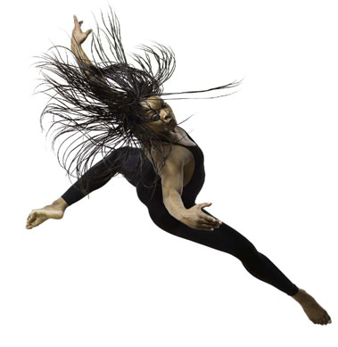
As I was listening to his lecture trying to figure out what exactly he was trying to convey, it wasn’t until he mentioned dancers that I understood!  Being a ballet dancer you cannot forgo the stress on the word “line.”  Everything in ballet is about “creating a line” and how energy flows through and out that “line.”  But it wasn’t just in dance that I learned to look for lines, but I always had this fascination with lines and how they can convey so much about someone or something.  Things that I was attracted to always had “good lines” (at least according to my own standards) – and this included everything from clothes, to observing an individual’s gait, the slant of a tree, or even a person’s handwriting.  
Odara Jaeali-Nash/PHILADANCO by Lois Greenfield


 When it comes to art, however wide you define it, it is lines that captivate us because they illustrate life.  In drawing people, one could either spend hours perfecting the exact lines to accurately depict that person’s features or spend half a second just to capture the energy and motion of the person.  I know my handwriting has at least 3 distinct types – all very different and all representing different temperaments but all very intentional.  Lampo Leong's work most often times uses Chinese characters unrelated to the theme of his work because he wants the energy of the strokes to convey the life of his artwork rather than the meaning of the words. 
Primordial Encounters by Lampo Leong

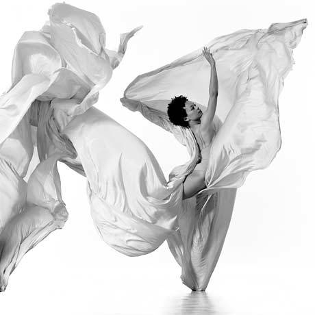
Scott McCloud points it out that even the “the most bland “expressionless” lines on earth can’t help but characterize their subject in some way.”  “In truth, don’t all lines carry with them an expressive potential?”  Lampo Leong stressed the idea of lines that possess energy and reflect the elegance of nature.  But however you put it, it is lines that captivate us and draw our attention because they portray and express life itself. 


Mia McSwaiin by Lois Greenfield


Creativity from Without


When I was young, I remember my sister made “Share World.”  In this universe, the earth was apparently flat blue construction paper and the people who lived in this world were made up of buttons, wires, and pieces of old circuit boards.  Unfortunately it’s now no longer existent (it was thrown away…), but for many years it was on display and received much praise and attention from my family for its creativity.

As already mentioned, designer’s must be able to make “Stone Soup” by crafting together random and various things.  But another skill that designers must have is the ability to see things out of objects that are otherwise overlooked.  To be cliché: “To take the ordinary and make extraordinary.” 

I visited the Jon Natsoula’s Art Gallery in Davis this summer, and one of my favorite pieces was an American flag made up of ordinary objects you find in the daily American life:  red plastic cups, ticket stubs, gum wrappers, and other common place things – all which caught me by surprise.  Unfortunately, I don’t remember the artist’s name and the Gallery was closed today (I am now on a hunt to find out the name of this artist!).  But, in the process of searching for this artist, I came across another who was able to find “creativity from without.”

Deborah Butterfield is a San Diego native who constructs her works of art from “junk materials.”  In looking at her work of horses, what caught my attention was her stark contrast in choice of medium.  Some of her horses were made with branches, highlighting elements of nature and grace.  In another, she used metals and dense objects, conveying characteristics of strength.  These two didn’t clash or conflict in their portrayal, but rather complimented each other.  Horses possess all these characteristics: a natural beauty and elegance while also exhibiting an essence of power.  I myself was fixed that she was able to emphasize and draw out the different qualities in each of them.  


Her success in able to communicate a kind of message through her work is what good designers do.  Good designers aim to communicate not just an image, but a message.  My sister named her little creation “Share World” because she wanted to portray a world where people share and where people care.  Each one of her people were happy and in the company of another “Share Person.”

I think she got it. 

The point is this:  We were made to share life, to share in each other’s lives, genuinely care for one another, let other’s in on what’s going on, and work together.  I guess you could say living daily life can become pretty mundane.  But this is the perfect opportunity!  - the opportunity to make something ordinary into extraordinary.  This little guy was made during the “Share World” Era, though not actually a part of it.  However, he still possesses the quality of that time.  Every day he might sit on the top of my mother’s desk, go through periods where he collects a nice coat of dust, but nevertheless he is there.  And no matter if he goes unnoticed or not he still sits there sharing some part of your life, even if just “Hi there.  I’m here!”


Sunday, October 10, 2010

Stone Soup


In class the other week, my professor explained the story of Stone Soup, a folktale which depicts the cooperative process of crafting something out of many seemingly unrelated things.  Last Tuesday, our Design 001 team created our own “Stone Soup”.


The process began with bringing all the random art-project things we collected separately from home and pulling it all together in one big pile.  However, what faced us was not only a pile of objects and doodads, but a pile of thoughts too.  I’m pretty sure its safe to say that initially, all of us experienced so-called “brain farts”.  For me, it was first, “What the heck can we make of all this stuff?” and second, “How are we supposed to do this together?


Over the years, I had become comfortable with doing my own solo projects.  And in group settings of the past, it wasn’t unusual for me to undertake the creative part of the project.  But this team was made of ALL creative people - people who were similar in the sense that we could all want to follow our individual creative agendas.  I actually became a little nervous because while we were looking at a pile of potentials for a masterpiece, each of us were also looking at a pile of potential head collisions.


I hate tension.  My biggest fear was, in cooking up our “Stone Soup,” we could have a “too-many-cooks-in-the-kitchen” moment.  However, to my surprise, what took place was quite the opposite.  Every member of our team listened to each other’s ideas or made positive suggestions.  In the process of making our “soup,” we all helped each other in various ways; whether it was “Hey, I’ll help you paint all these paper plates” or “That isn’t sticking well?  Let me find some tape for you” or “That looks great!”  Some contributed their own little creations to the pot and others looked for ingredients here and there to enhance the visual aesthetic of our “Stone Soup.”


Overall, I can say that our project wasn’t my favorite out of the whole class.  There were soups that expanded their dimensions up into the trees or took on a personality.  These blew me away.  However, I learned a valuable lesson:  Cooperation is possible.  When each of us took a humble approach and kept our minds open, we were all able to communicate ideas and build off one another's creative energy – something that I think is extremely beneficial in the process of design.  If I had to do it all by myself, I wouldn’t have had as such a large spectrum of ingredients or ideas.  I know for sure I wouldn’t have been able to complete the soup within the amount of time.


I might be stating the obvious, but I really think the story of Stone Soup is one of cooperation.  It's a story of not only bringing things together and creating something together, but also sharing something together.


Monday, October 4, 2010

First Impressions and Such Musings


I will honestly admit right now that I’m a t-shirt and jeans kinda gal.  Yup.  I’ve never really been all to into “fashion” and hence never thought myself to fall into the “trendiness” category of the fashion world.  I thought my deliberateness to wear just jeans and a t-shirt were my statement to the world that I thought about other things than just my looks.

And yet, 
...isn’t “fashion” a kind of statement? 

In my Design class a few days ago, we got into groups of ten and went around in a circle complementing each other.  What I interestingly caught my attention was that 100% of these compliments were based on each other’s appearances (80-90% of which were based on what the person wore). 

Why??

It was our first full week of class and hardly anybody knew each other.  We were basically all meeting each other for the first time.  Then it got me thinking; it wouldn’t make sense to compliment each other on our character, or our strengths and weaknesses as a person, or to encourage one another, or to affirm our unique talents.  We didn’t know each other.  We were all making our first impressions. 

If fashion is a type of artwork, a type of design, it is a form of communication.   And communication is a type of statement.  When we see something (or someone) for the first time we can’t help but notice appearance.   If you’re at a used book store and you find four copies of Dr. Zhivago, you’re probably going to pick the one that looks more appealing to your taste (or is in better shape) because it says something about the book and you.  Same for people.   What I was wearing was me trying to make a statement (an embarrassingly prideful one) about myself.  Someone who comes to class dressed a bit more on the dapper side might convey a little bit about how they pay attention to presence.  A person with bed-head can convey anything from staying up late studying or pulling an all-nighter playing video games.  First appearances might just be able to tell a little something about the person, but our first impressions are the things that are always incomplete.  My disclaimer here is, the saying still stands: “Don’t judge a book by its cover.”  But I would add, “…but the cover does tell us something.” 

And on that note, I really ought to be thanking whoever-it-was that made jeans fashionable! 


Now, I think I might consider putting a little more effort into my outfits.

First Encounters (and Not Realizing It)


When I was young, every birthday and every Christmas my Po-Po (Chinese for “grandmother”) would give me a children’s book, filled with colorful and fantastical illustrations that widened my little imagination.  Some of these books were full of classic stories, ballets, folklore, or tales that used no words at all.  And though after the passing of several years I had managed to accumulate a number of these, (each with the first page inscribed to me with her beautiful handwriting) I ashamedly admit that at the time I didn’t fully appreciate them. 


However, I as grew older I began to realize that my appreciation for art and stories started somewhere and that these books were actually my unrecognized precious treasures.  These books introduced me to art, to design, to storytelling.  The artwork in these books weren’t merely pictures within a page, these pictures sometimes extended beyond one page into another, filled the borders with illustrations or sometimes just between paragraphs.  These illustrations served purpose of allowing the author to tell a story beyond the limitations of a story alone.


When I first started painting, I wanted to paint a picture from a book called Shibumi and the Kite Maker by Mercer Mayer.  What I didn’t realize before I chose this as my subject, was the author’s creative use of textures and patterns to give his collage-like illustration a mystical and mysterious depth.  Although this made it extremely difficult to paint, it opened my eyes that art and design can go beyond the classical mediums.

Shibumi and the Kite Maker by Mercer Mayer

Another diamond amongst my treasures (that I am appreciating more and more even this instant) is The Mitten, an adopted folktale also illustrated by Jan Brett.  I remember I would sit for hours when I was young, staring at the pictures, not just because they were extremely detailed, but because the borders were each filled with a little story of their own, expanding the story to more than just what was written.

The Mitten by Jan Brett

These were my first encounters with design – and I didn’t even realize it.  Each of these books exposed me to design by showing me how, in their own creative work, to go beyond borders.  These authors and illustrators taught me my first and very important lesson in the process of imagination.

"A Tempest Within A Brain"*


I remember there was a day this past summer when I had just finished reading a good chunk of Les Miserables and was reflecting on a part of the story while sitting in the back seat of a car.  As I recollected my favorite chapter, I was also listening to music while watching the images outside the car window sweep by.  My thoughts were soon interrupted when my friend interjected and asked me, “What are you thinking about?” and I realized that I was at a loss of words.  Stranded on an island surrounded by an ocean of thoughts that were only known to me.

I think it is the deep desire of humans to want to communicate.  I mean, I don’t think people were meant to live alone.  Studies have even shown that when individuals are placed in isolation, they go crazy.  Everyday in society we see peoples’ attempt to communicate to others, whether it be an advertisement for milk, writing an essay for a class, or venting to a friend, we all convey a need to communicate.   

Something I’ve thought about alot lately is how to communicate things in our lives that are not quite describable in words.  Victor Hugo spent nearly thirty pages solely describing the condition of his hero’s heart, but even that was probably insufficient in portraying to us a more accurate picture of Jean Valjean’s state.   How many times have we turned to music or art to help us convey better to others our feelings, our hurts, joys, fears, hopes – to show people the things that truly and deeply move us.  

I know that when my friend asked me this question I felt this inner frustration (which wasn’t actually too unfamiliar) at my inability to tell him exactly what I was thinking.  This wasn’t the first time this had happened.  How was I supposed to convey to him ALL the things I was thinking about?  Most of my thoughts weren’t even put in words.  See, when I said I was “thinking” about this particular chapter, I wasn’t merely recalling what happened in the chapter.  I was really thinking about the chapter, I was empathizing, relishing, reflecting.  Mixed into the bunch were (as I can best “describe”) melodies, harmonies, colors, movements, memories, emotions, feelings.  

Like I said, this frustration wasn’t my first encounter – and without a doubt I am sure others have met this little provocation.  A “provocation”?  Yes.  And that’s exactly what it is! It provokes.  It provokes us to seek out more ways to communicate and ways to receive communication.  It provokes us to create and imagine – to design ways to communicate to others the things that move us.


*Victor Hugo- "Fantine: Book Seven, III"

today's song: "Know Your Onion!" - the Shins