Monday, November 8, 2010

艾未未 - Artist, Designer, Political Activist


Beijing Olympic Bird's Nest Stadium by Ai Weiwei
            It is recent news that Chinese artist and designer, Ai Weiwei (艾未未), was put under house arrest in China due to conflict regarding the demolition of his studio in Shanghai.
Without getting into too much detail of what is going on, I was introduced to this man’s work and how he uses his art and his design to create conversation and to represent his voice in China.
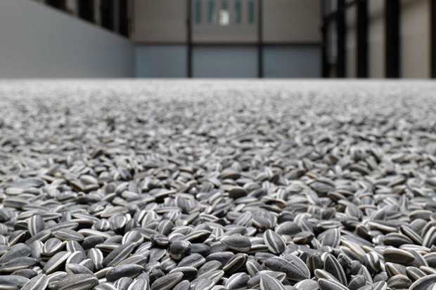
Sunflower Seeds
            I think one of his works that Americans will recognize was his design for the Beijing Olympic Bird’s Nest stadium.  However, his work has been gaining attention for quite a while and is most notable for his strong political opinion.  One of his most recent projects was a room in Tate Modern Turbine Hall, which is filled with one hundred million porcelain replicas of sunflower seeds, each painted by Chinese artisans.  Some inferences include the topic of mass production or Mao as the “sun” of China.  In looking up other pieces of his work I find that his project indeed have some message to them.  For me, I might have to dig for what those might be, but I am curious to find them since his works are captivating.  Especially now, since he seems to be trying fervently to hold a conversation with a medium other than words.  For now, I’ll just post some pictures of what has caught my eye – and what I want to investigate.

 
Fake Studio
Forever Bicycles
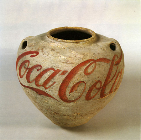
Han Dynasty Urn with Coca-Cola Logo, 1994

Letters and Stories


There was a story I once read, I can’t remember where, (maybe Highlights magazine?) about a girl aspiring to be a writer.  She described her preference to writing by hand and letting the ink of the pen hit the surface of the paper, giving her story character and personality through just the writing – which proved to be another motivating creative force behind her story-writing.  She contrasted this picture with the process of typing a story on the computer, where words and letters were became cold pieces of concrete. 
I don’t remember why exactly this story stuck in my head, but I knew it always bugged me that I couldn’t remember where I read it because what I do remember is the feeling that the written word conveyed so much more than just the words itself. 
Written words (in contrast to typed or computerized) offered more depth than just the definition and comprehension of the words and phrases put together.   Now a lot of this is arguable since perhaps many of us would look at old typewritten letters or word-press books as mediums with “character.”  However, when you look at handwritten notes, letters, or signatures – there so much of a story that can be found.
A few weeks ago I was in an antique shop and just as I was about to leave, my eyes fell upon an old green Victorian guestbook, filled with notes and letters to a woman.  For ten bucks I was able to read through all these notes, imagine stories, assume relations, mysteries, maybe secret likings to this woman who asked all her friends to write a small note in order that “whate’er befall, The names of all my friends’ recall.”
Each of these notes had characteristic handwriting, beautiful lines of elegance that portrayed a little bit about the person who owned them (you can read my blog about how lines portray energy).  Some I would recognize and go back and realize that some friends had written more than one note of sincerity.  I mean, this was back in the day when people would study the art of writing in order to convey a certain image of themselves.
One particular handwriting that caught me was that of the woman’s daughter.  In one of the first pages a beautifully written note is addressed to her mother.  However, I came across another note from the same daughter but in much more crude handwriting.  it must have been written years earlier since it conveyed the characteristics of a little girl in her first years of learning to write.  What a story that has!  Just by the handwriting alone I started to imagine what their relationship was like, and how it might have been for the daughter, years later, to come back and write again in her mother’s book.
            I think that written words are kind of like an art – somewhat like painting.  A person’s handwriting can convey a little bit about themselves and maybe a little more about a story.

"The Rag Man"


I remember the first silent film I watched.  I had just come home from school and had turned on the T.V. to Turner Classic Movies when I saw early black and white film scenes set to music – no audible words.  I was pretty ready to dismiss this, thinking to myself, “I don’t want to spend any effort right now to try and figure out what’s going on.”  But as soon as these thoughts came into my head, the title card for the scene came up, I read it, and then I found myself hooked. 
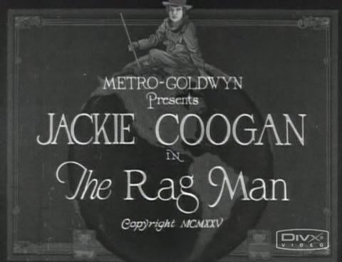
MGM's The Rag Man title card
The film was The Rag Man.  Produced by Edward F. Cline in 1925 and starring Jackie Coogan (discovered by the unforgettable Charlie Chaplin, and later known as The Addams Family’s “Uncle Fester), it captures the story of a young orphan boy who survives a fire.  He gains his freedom by the mistaken belief of his perishing, and roams around with a “junk man.”  These unlikely two develop a special relationship that the rest of the film reflects. 
Max and Tim
While watching this movie, I found myself completely mesmerized by the story.  Although the words were not audible, they were just as important in the role of captivating the audience.  In fact, the creators of the silent film probably had to learn the knack of capturing an audiences’ attention in a different way than actors on a stage do, or “talkie” movies that include modern films today.  Cartoon artist, Brian Fies, explained that when words and picture come together, they should be dependant so that one cannot stand alone without the other.  His analogy was something that words and picture should be what rock music and lyrics are when combined.  Lyrics alone are just “bad poetry” and rock music is really just “a bunch of chords repeated and strung together.”  Yet, when put together, they create a medium that is enough to make one cry.  In the same way, when words and picture are put together in a successful and artful way, they can create something that captivates a person, as The Rag Man did for me. 

Singin' in the Rain's "Royal Rascal"
P.S.  As a side note, I love Singin’ in the Rain’s satirical usage of this concept – which in fact, only proves how written word and picture can unite to create something that, once again, captivates people.

Monday, November 1, 2010

Butch Cassidy and the American - Sorry, Sundance


I must first off say, that this blog was sparked by Intentional Design’s blog, “Compare and Contrast: Design in Film Posters 3 - The Good German”.  I was stoked when I happened on his blog because it reminded me of those fuzzy feelings that were conjured up when I first saw the poster for The Good German.  When Intentional Design noted the reference to the unforgettable Casablanca classic I was enthralled since not only is Casablanca one of my favorite films, but to know that there are still nods to the era of the silver screen made my day.

After reading his blog, it reminded me of a similar experience about a month or two ago when I saw the poster for The American.  I haven’t seen the movie, but I love the poster. 

For me personally, it struck a chord with another classic film, this one from the 70’s (er, 1969).   Both The American and Butch Cassidy and the Sundance film posters use two or three basic and contrasting colors.  The American: a dense orange contrasts with the black and white used for the type and silhouette of George Clooney.  Butch Casssidy uses a yellow to contrast with the black silhouettes of Paul Newman and Robert Redford.  Notice that there are also references to pure black and white imaging as well.  The American - George Clooney's figure; Butch Cassidy - the inset of Butch and Etta riding on a bike.  The typed credits are also in similar placements; skewed and aligned to the bottom left half of the poster.  It’s also not unapparent that the main figures in these two posters also happen to possess some ammunition.  

Whether or not The American movie poster, designed by Mojo, is a tribute to the vintage style of classic films is not part of my knowledge.  However, when looking at this poster I, myself, cannot help but recognize that I am reminded of images from an earlier Hollywood.  It may serve as an example of how images (or styles) can become iconic, and then serve as another means of communicating a type of message (in this case, perhaps a reference?)

Objectified


Objectified by Gary Hustwit is a documentary style film that searches for the relationship between mass-produced objects and their designers.  It does not just skim the surface of the background of the designed objects, but the film also covers interviews with the actual designers themselves in order to really find a truer history of the life of these objects, but also understand the intent behind their design., in an interview with Wayne Taylor, had said “Like Henry Ford once said, ‘Every object tells a story, if you know how to read it.’  So I enjoy digging into these little stories behind the hundreds of objects we touch every day, that usually go unnoticed.” And as is appropriate, Hustwit goes into finding these stories in his film, Objectified.
Andrew Blauvelt
I think one of the most surprising examples of a story behind a common ordinary object was Andrew Blauvelt’s explanation of the Japanese toothpick.  He points out that the Japanese toothpick, unlike its American counterpoint, has a blunt end with grooves around the circumference of the flat end.  Those grooves serve more than aesthectic purposes:  The grooves allow for easy break-off of the flat end, sending a signal to others indicating that this toothpick has been used.  The broken off end can also be used as a small stand to prop the tooth-end of the toothpick from the table surface.  Blauvelt, after revealing the “secret” of the Japanese toothpick, goes on to explain that this unveils more than just the secret behind its design, but it also gives people a glimpse of the design history that went into creating this otherwise commonplace Japanese utensil and a look into the culture from which it came from.
Andrew Blauvelt reveals the "secret"
The film Objectified covers many themes and many topics, but if Bierut’s words are true – that not everything may be design, but “design is about everything” – then we must be, in fact “ready for anything.”  Whether that design is considered “good” or “bad” is another story, but as Gary Hustwit explores in his film, design and the story and intent behind that design can be found everywhere.

Briar Coffee Cup


In an effort to get away from a less than quiet household, I retreated today to Common Grounds to study and do some blogging only to find that tonight that the internet here was, unfortunately, down.  I actually almost gave up trying to get any work done when I realized that I could, in fact, take the opportunity observe objects of design around me that I probably would have initially disregarded.   
            So here I am, staring at my Latte, realizing that the lid enclosing my hot purchase is a product of design.  These plastic lids are mass-produced, well known companions to any avid coffee drinker, and so incredibly common that the idea that these attachments to the ubiquitous Solo cup required some kind of effort of design may well have been overlooked. 
Karat Hot Beverage Cups
            However, the more intently you look at this seemingly mundane item, you begin to realize the amount of effort that must have been put into designing this plastic lid.  Think about it, hot beverages are a considerably dangerous product.  Careless design could leave a cheerful coffee drinker a regretful one should the container allow a leak or a malfunction cause a spill (which, I am sure, is not unfamiliar to a few).  
Briar Pipe
            This lid, produced by Karat, is black.  It consists of a raised outer circumference that has a oblong hole to allow for convenient sipping.  Behind this cutout the lid dips down into a trough that slants at an angle so that should any liquid escape from the inside, it channels down to one collected area and not drizzle down elsewhere, like the sides of a cup where it will most likely get sticky.  There are also holes in two places, one at the bottom of this trough and one opposite the drinking opening.  This, no doubt, allows the consumer a more smooth drinking experience – that if volume is displaced, it must be replaced. 
Yet, the first thing I noticed was that the lid is just a part of a two-part functioning whole, much like the Briar Pipe that Le Corbusier characterized as the Zeitgeist symbol of his day.  Is this the Zeitgeist of our day?  Disposable cups and lids? The first thing that comes to mind is “landfill.”   However, in my research both Solo and Karat are making efforts to make their mass produced products “green” and eco-friendly – a task that many notable designers declare should be the responsibility of designers.   
So all in all, this two-part disposable coffee cup is in fact, a product of intentional design. Everything from its shape, to its color, and even its biodegradable makeup are just a few aspects of the effort put into designing this product.
Karat Earth Products

Monday, October 18, 2010

Go 2


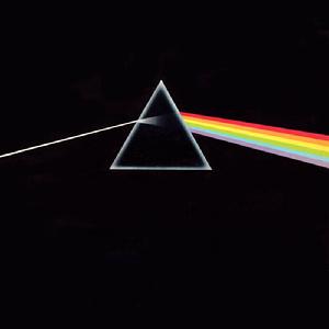
Pink Floyd
The other day I was listening to some music, browsing artists, and researching bands up on the internet, particularly XTC.  What caught my interest was that one of their albums was noted for its album cover art, which was designed by British art design team Hipgnosis.  Now, I can’t say that I know a lot about their work, but they’ve obviously have built up quite the “resume” by doing art work (many of these now iconic) for bands such as Pink Floyd, AC/DC, Led Zeppelin, Yes, Genesis, and more than a handful of others.  

What intrigued me about their work for XTC’s “Go 2” album was that its design was novel, it was different.  It basically depicted the structure of the design itself.  Here, I’ll just let you see for yourself:

XTC "Go 2" cover album design by Hipgnosis


They do this not only for the back of the album but also for the cassette release as well.  

XTC "Go 2" back cover album design by Hipgnosis


If anything, its brilliant in exactly what it describes.  It caught my attention, lured me in – I fell victim…and maybe, just maybe, brownie points were added subconsciously in favor of the album. 

XTC "Go 2" cassette design by Hipgnosis
As a work of design, I think its great because although it might be stating the obvious, its obviously not the norm.  It’s so simply “unimaginative” that it proclaims “creative.”  I personally like the design because it takes thinking inside of the box outside and sometimes, I think that's something designer’s need to do.  Kostas Terzidis explained that the concept of novelty in design just merely an illusion of creating something new.  Hipgnosis’s radical design was merely going back to the basics of what an album cover is (or how they explain).  This doesn’t devalue their work for “Go 2” in anyway.  In fact, I think it only makes it more admirable because of the fact that they were successful in creating exactly what designers all try and aim to do – to go back to the roots and from those roots make something, even if just an illusion, new.


My only question:  With the age of technology developing and the music industry taking place more on the internet via download, what will become of the art of album cover design?  Your thoughts?